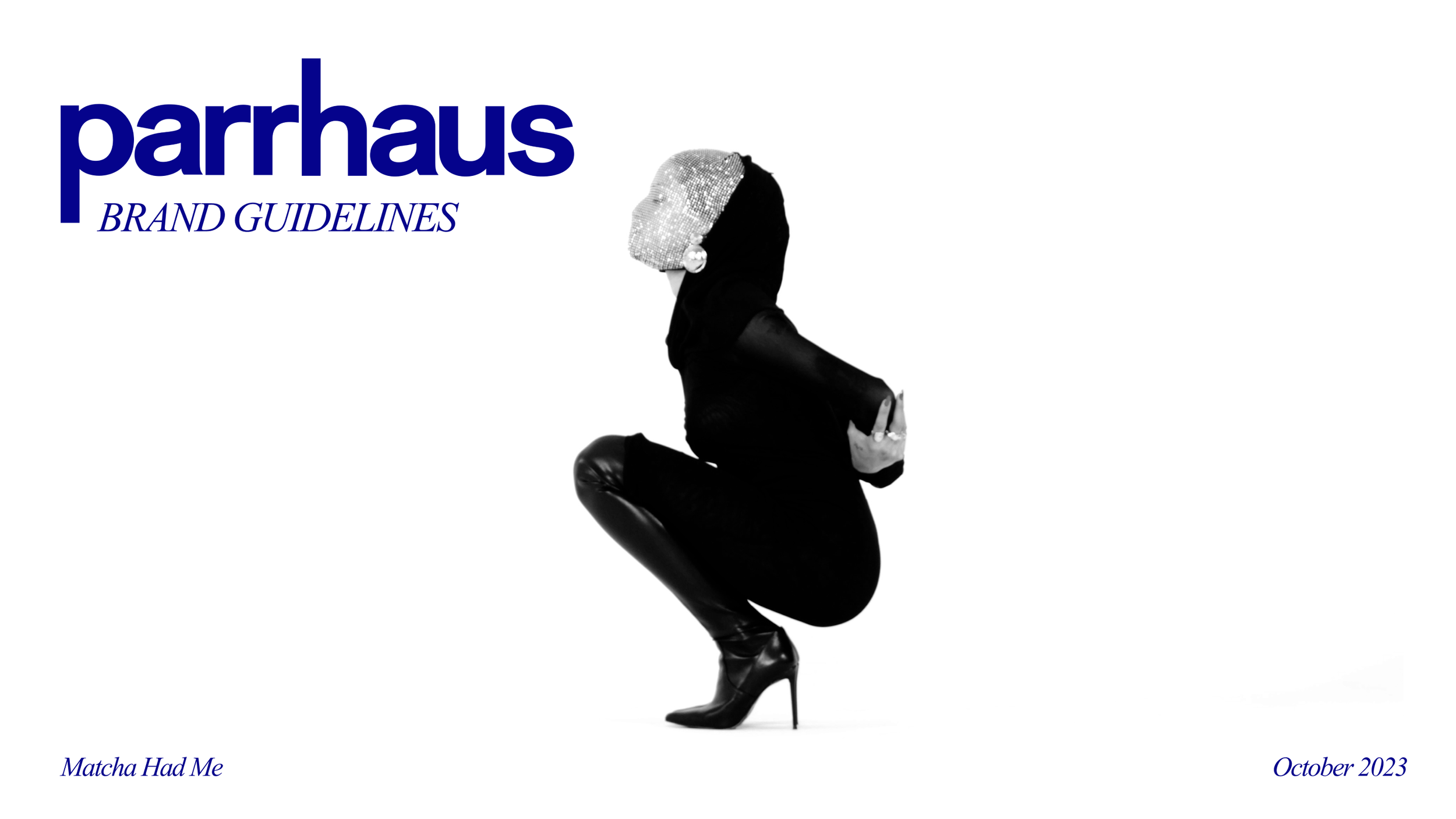
FREELANCE
PARRHAUS BRAND FOUNDATION + PACKAGE
I was connected with Chloe, parrhaus Founder + Creative Director, and tasked with crafting parrhaus’s full foundation (intro suite) of branding – including logo, typeface options + color palettes – as well as a one-pager for perspective clients + some social graphics.
I absolutely enjoyed getting to bring Chloe’s vision for parrhaus to life + bringing my eye + expertise to this new content studio.
Assets + decks were created in Figma, Illustrator + Photoshop.

BRAND FOUNDATION
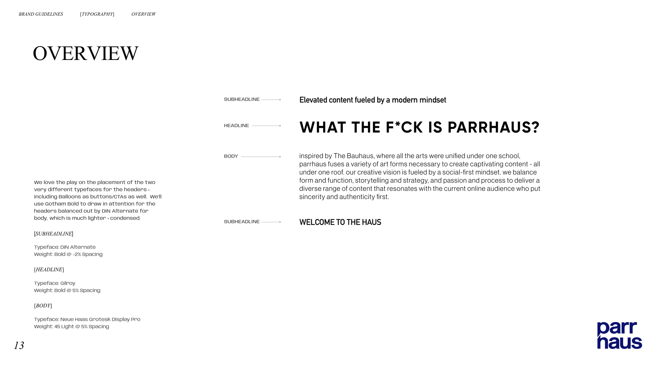
In the Brand Foundation, I created parrhaus’s visual brand identity + guidelines. These are inspired by Chloe’s aspirations + brand core along with moodboards I created to bring her vision to life (see below).
I wanted to lean on Chloe’s love for + inspiration from the Bauhaus movement – all while making everything clean, bold + elevated – that was very modern yet with a retro feel.
LOGO
STACKED LOGO
LONG LOGO
P ICON
SYMBOL
COLOR PALETTE
TYPOGRAPHY
BRAND GUIDELINES


BRAND INTRO PACKET
I created a 3-page parrhaus intro packet for perspective clients outlining who they are, what they do, why to work with them, etc. along with a menu highlighting their monthly retainer packages + à la carte services. I wanted to keep the design elevated yet simple so that it was easy to read + digest all of the information. I also created the Menu page to look almost like an actual restaurant menu.
SOCIAL GRAPHICS
To get the ball rolling on the parrhaus Instagram page, I created specific social graphics to feel like magazine ads from the 60s (think Mad Men). These lay out a lot of the same information from the Packet but in a different form.
WTF IS PARRHAUS
WHAT WE DO
WHY PARRHAUS
WHERE WE LIVE
ADDITIONAL GRAPHICS
ADDITIONAL BRAND DECKS
As part of my client process for an Intro Brand Package, I like to start with Moodboards + Brand Concept(s) as we hammer out the final directions for logo, color, type + graphic treatment.
BRAND MOODBOARDS
After our initial call, I took the three directions Chloe was interested in and crafted a distinct moodboard for each. We ended up going with a creative direction that was a mashup of sorts between Direction 2 - Editorial + Direction 3 - Modern.

BRAND CONCEPT
Since we had a distinct direction for the brand’s visual identity, I put together various options for each logo, color palettes + typeface pairings. We were able to finalize options for each category as part of this final Brand Concept deck.
