
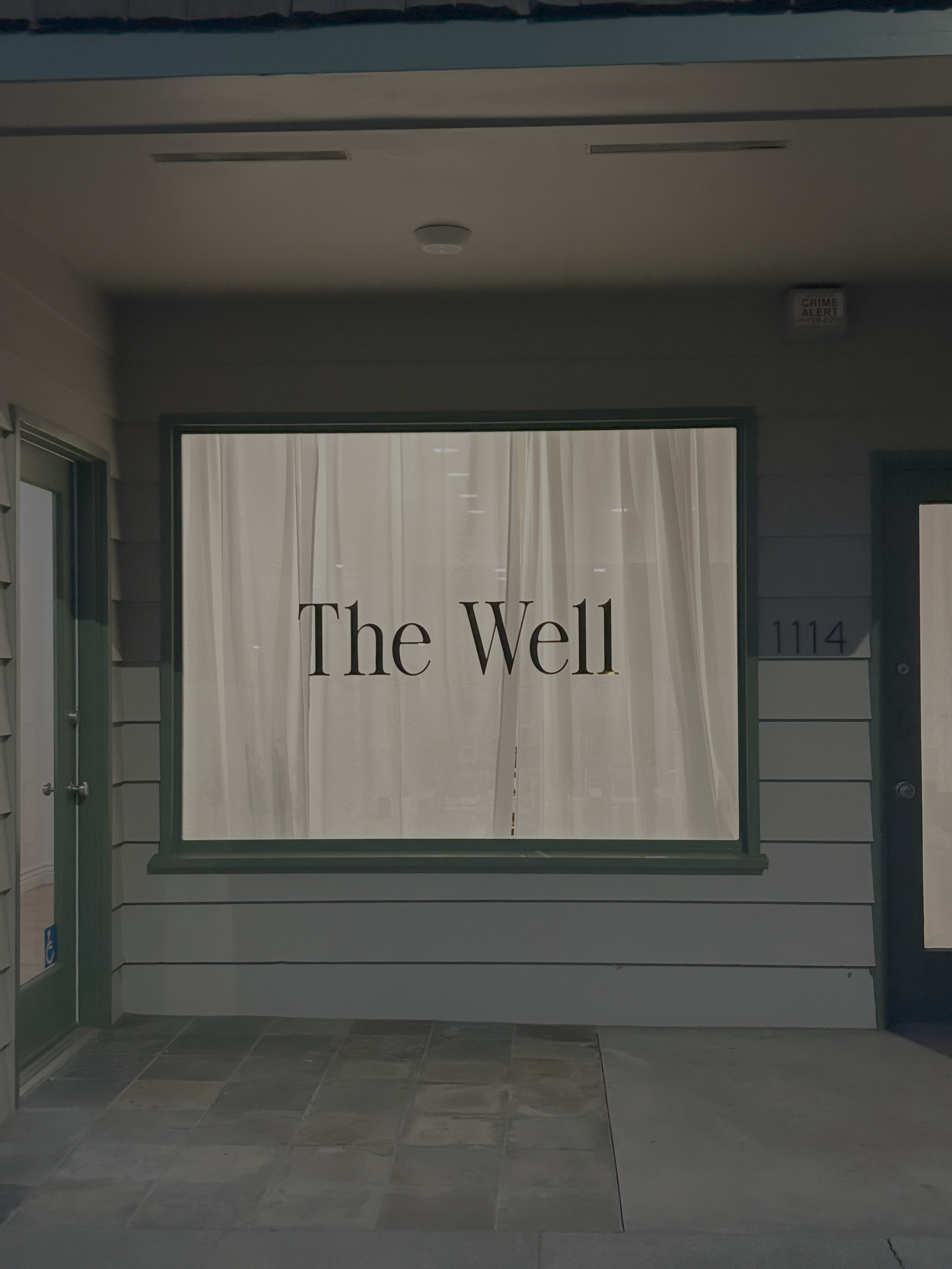
THE WELL BRAND IDENTITY + WEBSITE
“Nadia not only understood the vision, but more importantly she captured the true essence behind my brand. She listened to my brand story and transformed it effortlessly into a full visual brand package that really represented the main purpose behind my business. She was so inspiring to work with, extremely collaborative and communicative, and I learned so much more about my brand throughout the creative process! Thank you so much for making my ideas into a visual reality!”
- Danielle Valencia, The Well Founder + Lead Instructor
My dear friend, Danielle, asked me to help bring the visual identity of her new fitness studio, The Well, to life. We went thru various brand exercises + explorations to truly zoom into the studio’s ethos – bringing it all together succinctly in one ecosystem.
Assets were created in Figma, Illustrator + Photoshop. Website built in Squarespace.
BRAND FOUNDATION
Our Brand Foundation perfectly emulates all that we compiled when it came to who this brand is + how it shows up. The Well is a grounded oasis where mindful movement meets playful determination, guiding each person along their unique journey through the beautiful imperfections that make us whole – so our visual identity had to hit that the a T!
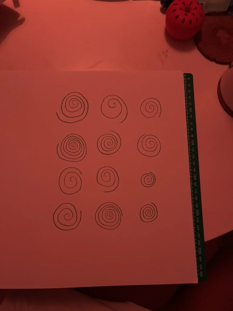
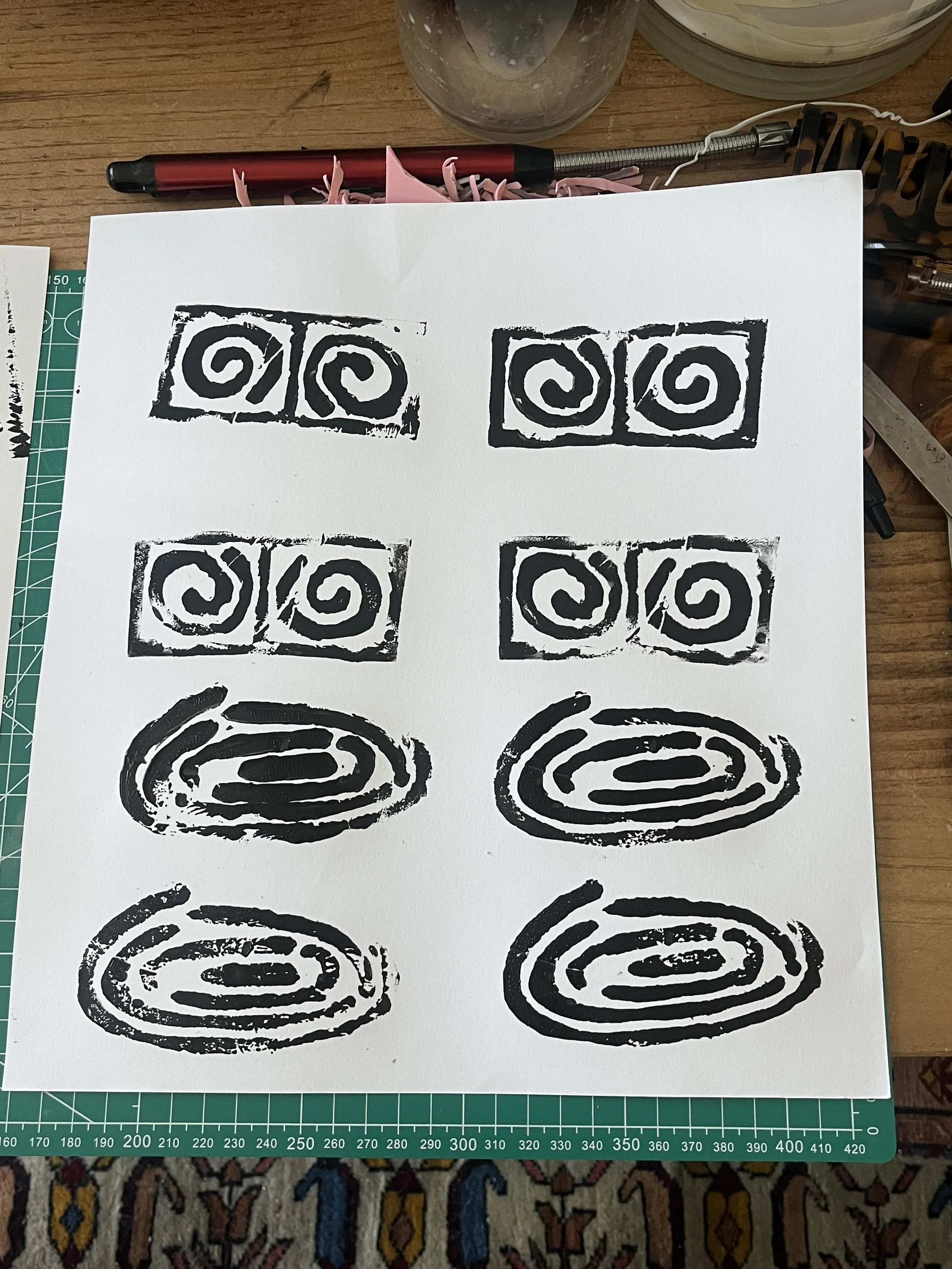
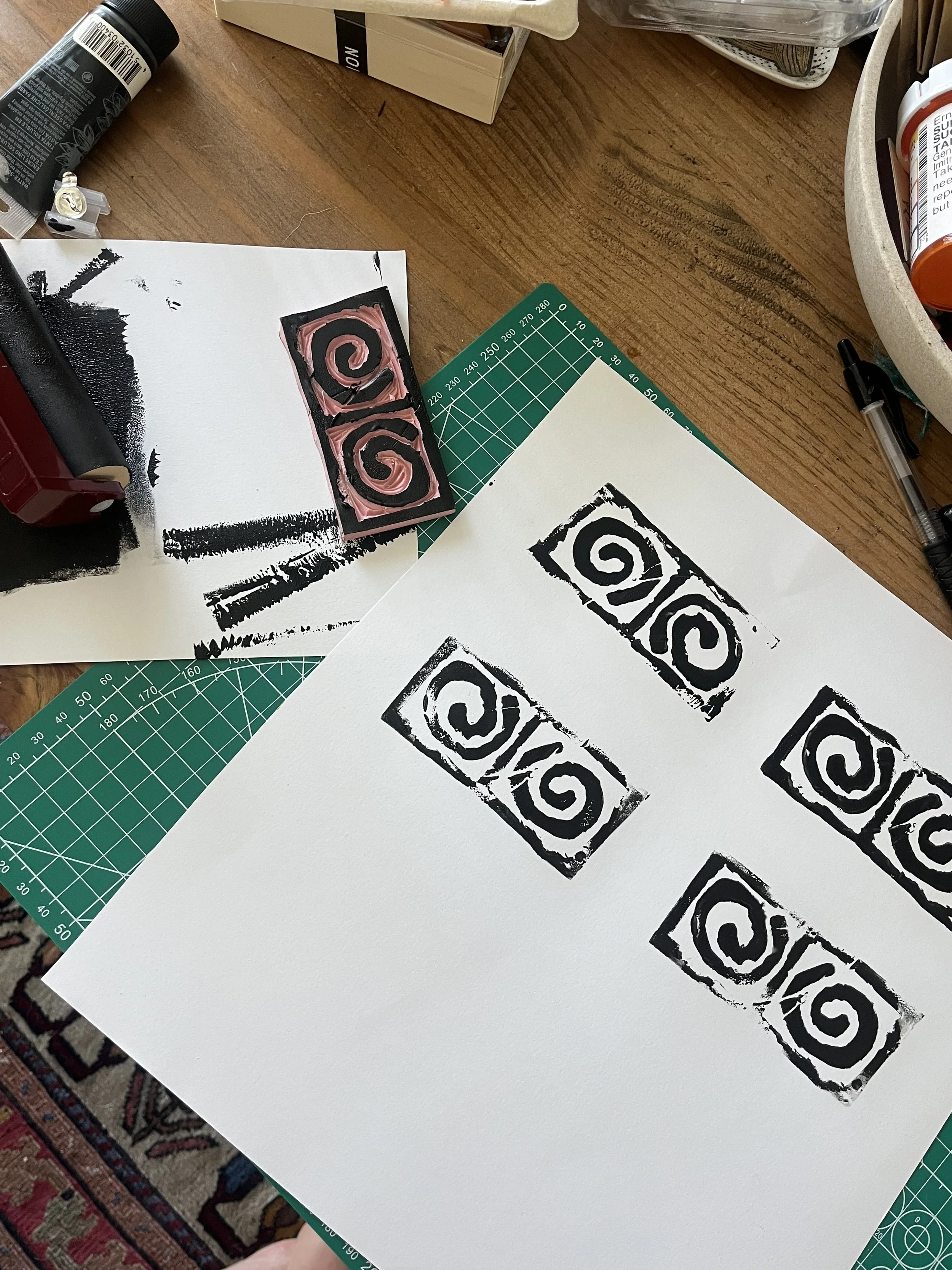
LOGO EXPLORATIONS

FULL LOGO
MAIN LOGO
LETTERMARK
SYMBOL
SPECIAL SYMBOL
COLOR PALETTE
TYPOGRAPHY
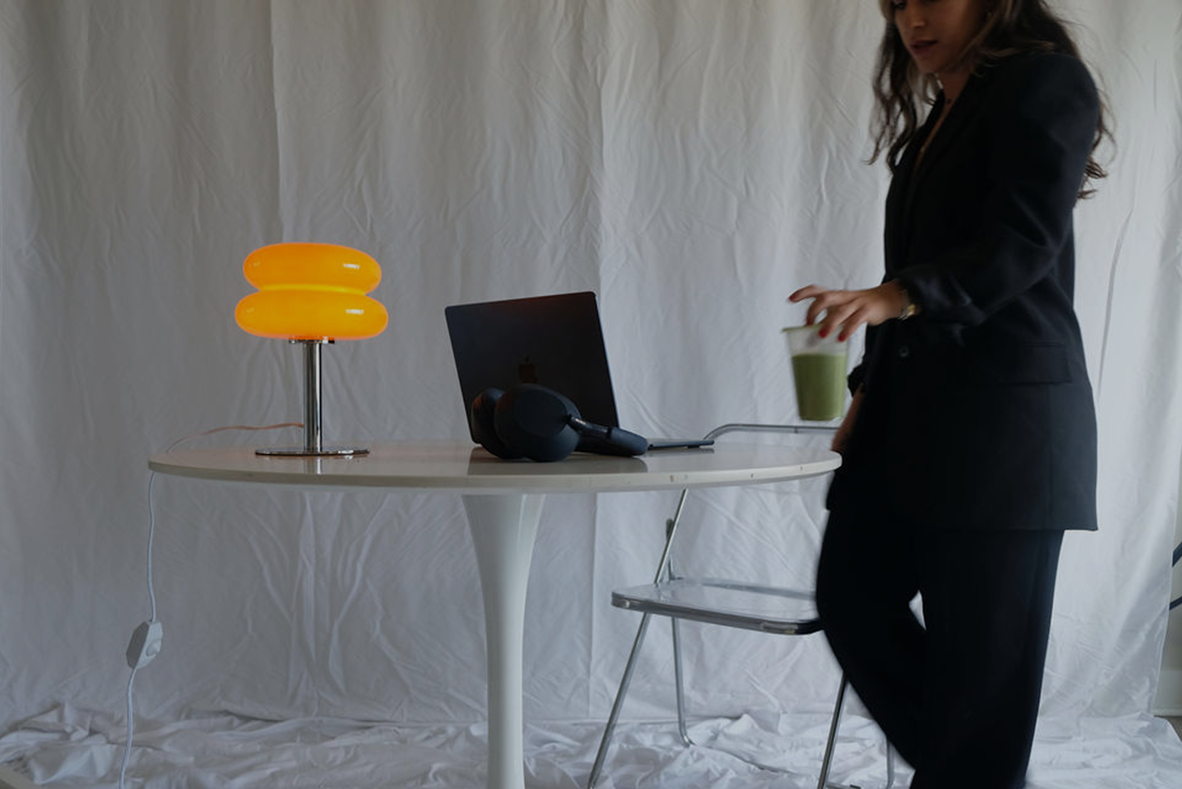

LET’S GRAB A MATCHA !!
Want to work together? Hit our line & set up time for your *free* intro call.