
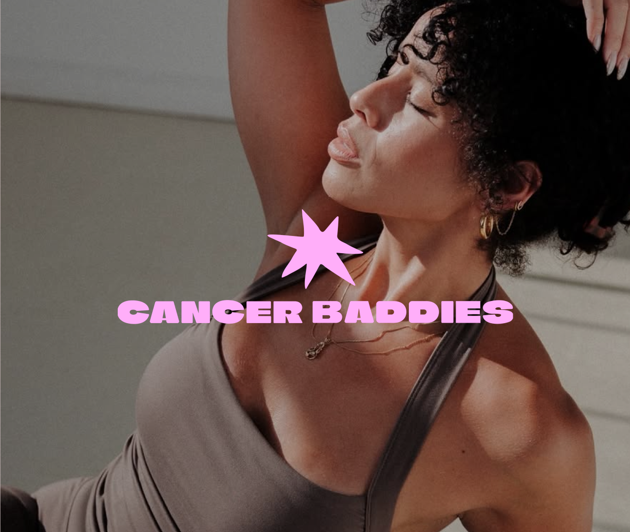
CANCER BADDIES
BRAND IDENTITY + DESIGN
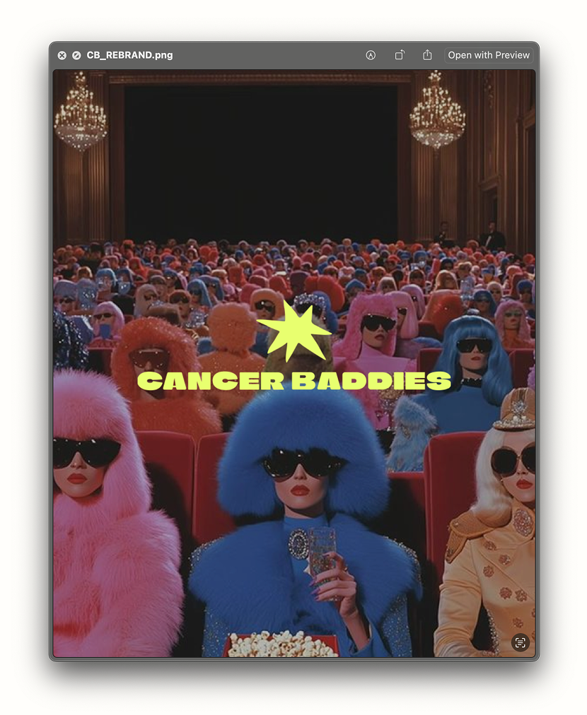
Amanda, Cancer Baddies founder, came to me to assist in revamping her brand’s visual identity – really honing in on how CB shows up in the world. We took the foundation of the organizations’s launch a year prior along with the liveliest of inspiration to really bring Cancer Baddies to the world.
Assets were created in Figma, Illustrator, & Photoshop.
“Working with Nadia and Matcha Had Me to create a total rebrand for my organization really was the pinnacle of change for taking my company to the next level. We needed something that matched our product, community, and voice that set us apart from other brands. Nadia made the entire process so easy and our final branding is everything we were looking for and more!!! We've received so many compliments and I am excited to continue to work with her on more creative projects.”
– Amanda Bulter, Cancer Baddies Founder
BRAND FOUNDATION
Being a baddie simply means to live out loud, and being a Cancer Baddie means that in the most holistic sense. Keeping that in mind, our CB brand foundation is popping, colorful, bold & fun.
LOGO

COLOR PALETTE
TYPOGRAPHY

LET’S GRAB A MATCHA !!
Want to work together? Hit our line & set up time for your *free* intro call.